At Adina Designed Interiors we can cater for all your cabinetry needs. We pride ourselves on good honest advice, professionalism and quality work built to last.
12 Amazing Shop Design Ideas To Get More Sales [+Pics]

Despite the popularity of online shopping, the bricks-and-mortar store still provides a huge amount of income for businesses. But as customers become increasingly discerning in terms of how and where they spend, retailers are being pressured to think of new and innovative ways to keep and capture customers.
From window displays and visual merchandising to fit-out and product placement, a myriad of sensory elements can keep customers inspired and engaged. Here are twelve amazing shop design ideas that do just that.

Image from The Architecture Designs
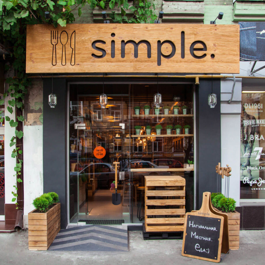
It takes an average of eight seconds to walk by a typical storefront. But in this case, we think pedestrians will be enticed to linger a little longer. From its bold, greenery-edged signage to its planter boxes and furniture, timber reigns in this design and adds to a rustic, organic effect. Multi-functional furniture adds a contemporary edge, and in terms of shop façade design ideas, this is also a clever use of space with the glass entrance enhancing the establishment’s size and showcasing the rich, warm, and welcoming interior within.

Image from Pinterest
If you are in the business of selling technology, outdated fixtures and furnishings simply won’t cut it in this current digital age. Here, the ultra-modern joinery highlights this room’s streamlined functionality, and clever shelving options allow ample room to showcase its high-tech offerings. The white, beige and black palette enhances the contemporary theme with pops of colour provided by textured plant life and funky futuristic stools. Neutral flooring, walls, furniture and artwork create a relaxing sense of space, and the myriad of different feature light configurations up the “wow” factor.

Image from Design Milk
Lovers of warm treats and Scandy design will enjoy this bakery, with its beautifully blonde-hued timber furniture, finishings, and wall panelling. Perfectly complementing this palette is an abundance of white that highlights the space as a modernist interior. Splashes of baby blue add a welcoming ambiance, and the abundance of soft lighting creates a warm-as-toast feel. A cosy couch, modern joinery, and a stunning glass entryway complete the look.
This is simple, elegant and non-conforming design at its best.

Image from fohlio.com
This is uber-enticing, somewhat ethereal retail storytelling that draws the customer in and invites them to explore an Aladdin’s cave of can’t-resist-buying delights. The entrance way is dramatic without being jarring with its rounded contours and leafy edging, and the oriental-style rug adds softness, texture and a touch of intrigue. Colour-wise, the palette is soft and inviting, and strategically placed, multi-sized shelving gives the customer an undeniably sensory experience. Whimsical, magical, engaging … whatever the feelings that are evoked, this treasure trove presents a shopping experience that could last for hours!

Image from DNS Industries
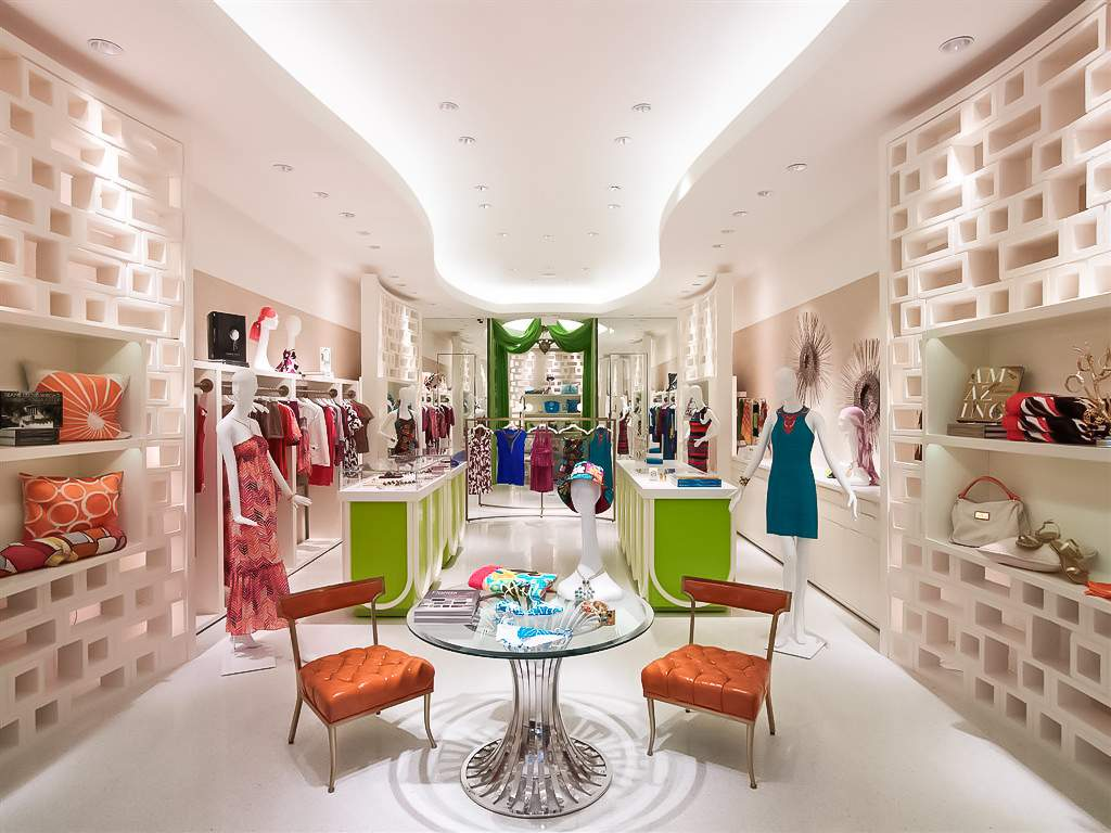
Modern with a retro twist, this store’s white foundation palette is the perfect backdrop to accentuate its dramatic and playful pops of kaleidoscopic colour. Visually, the focus is on product, but that focus is subtly expanded to take in the lime green cabinetry, fire-orange chairs and emerald change room curtain. But don’t be deceived (although you can be — it’s glorious) because textures, angles and lighting also play an important role here. The illuminated contours of the ceiling, shadow effects that create interest, and bespoke honeycomb shelving combine to create a virtual retail candy shop!

Image from House Beautiful
There is no doubt what the hero in this shop is. Product, product, product. Fuss-free, no-door cabinetry down below and the lighter-hued shelving up top creates the perfect backdrop for this beautiful selection of pottery and dishware. Combining muted, earthy beige tones with stunning tangerine and teal highlights, the predominately white colourway evokes a feeling of must-have, handcrafted uniqueness. Basket texture, subtle track lighting, and some bright-coloured flora completes this homeware-loving customer haven.

Image from Dezeen
Mmmm…a mystery waiting to be unearthed. There is no better way to create intrigue than by revealing-but-not-revealing what your brand is about. Other than in words of course. Bob is pretty upfront about his product, but the use of custom-illustrated fonts adds a decidedly creative twist to the offering. It creates a strong visual identity that exudes “public art” and hints at the not-your-average product range offering inside. A combo of white, black and metallic furniture, warm-looking interiors and an open entrance add to the “look inside and you’ll be surprised” strategy.

Image from www.justbobbi.com
This display literally screams for engagement – pick me up, open me up and smell me! Form, function, colour, texture and lighting all beautifully combine to make this product and its packaging really shine. The shelving is the perfect choice with its open plan design and colour palette - pink that exudes femininity and black, sophistication. Divine styling enhances the effect with its groupings of different sized products to create visual interest. And the addition of vibrant plant life gives a subtle nod to the organic-ness of products that are guaranteed to pamper.

Image from Dezeen
Masculinity reigns in this retail store and visually, everything is ordered and linear – there are no curves here to detract from the male-ness of the product offering. The fit-out is an eye-catching array of functional shelving in a neutral palette that heroes the clothing. Although the pop of red on the racks evokes feelings of stimulation and (hopefully) spurs the consumer into opening their wallet! Textured ceilings, modern track lighting and contemporary tiling blend in seamlessly with the rest of the space to create a quiet oasis for manly browsing.

Image from apartmenttherapy.com
This coffee shop exudes a lovely combo of homeliness and sophistication. Its vintage general store vibe is enhanced with the classic mouldings on the bench spaces and pops of retro colour on the coffee machine and display counter. Crisp white shelves amply display porcelain mason jars and colourful product offerings, and the large pendant lamps offer warmth and visual interest and give a delightful nod to the owner’s passion with their “baker’s whisk” design. What a wonderfully welcoming spot to enjoy a warming brew.

Image from remodelista.com
A glass shopfront and the subtle colouring and beautiful grain of a timber-clad exterior immediately exude a nature-inspired vibe, and invite all those who pass by to find out more. Neutral flooring offers a seamless passage into the open plan interior that is purposely designed for take-your-time browsing. The white, open shelving displays the brand’s product to optimal effect and is enhanced by bright directional lighting. Pops of greenery and a black feature wall that is partially covered in oiled cedar slats enhances the organic effect and adds texture to the space.

Image from www.pradomercearia.com
Foodies … stop salivating. But how could you not with this divine culinary-celebrating creation? With a nod to early 20th century traditional grocery stores, it is brimming with colour and vibrancy. Divinely dark timber cabinetry exudes an artisan flavour, showcasing a myriad of menu enhancers. The moss-green walls, rustic shelving and patterned tiling support this organic theme, and everything else, from the hand-hewn chopping boards and flavour-filled mason jars to the ceiling-hung garlic and salted meats just ups the inspirational ante.
Adina Designed Interiors
Queensland Wide Service
Bundaberg
2/35 Enterprise St
Bundaberg Central, QLD 4670
Ready to have your design vision come to life?
Get our creative team of designers and craftsmen to help you create a memorable space.